Project Brief:
Create a visual brand identity for a hypothetical company whose product raises money or awareness for an endangered species. Combine typography and visual elements from both the product and the endangered species to create a logo. Explore variations of the logo concept, and design a stationery system to demonstrate the breadth and adaptability of the visual identity system.
Process:
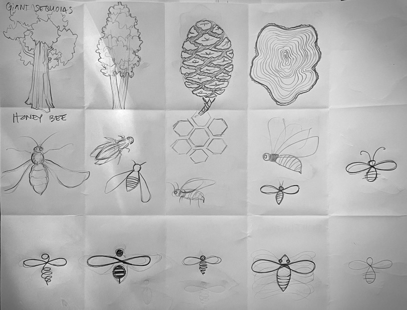
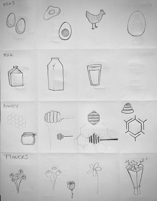
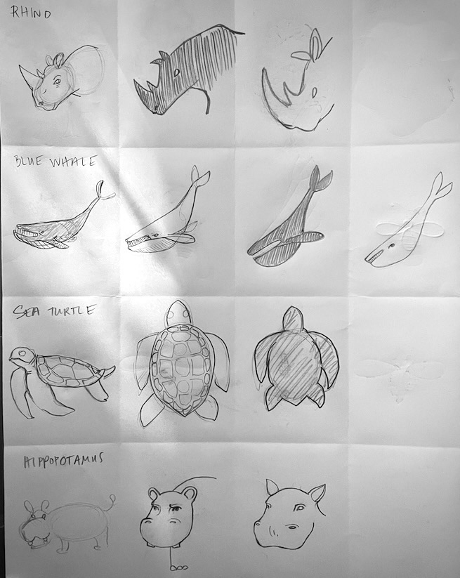
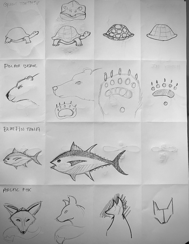
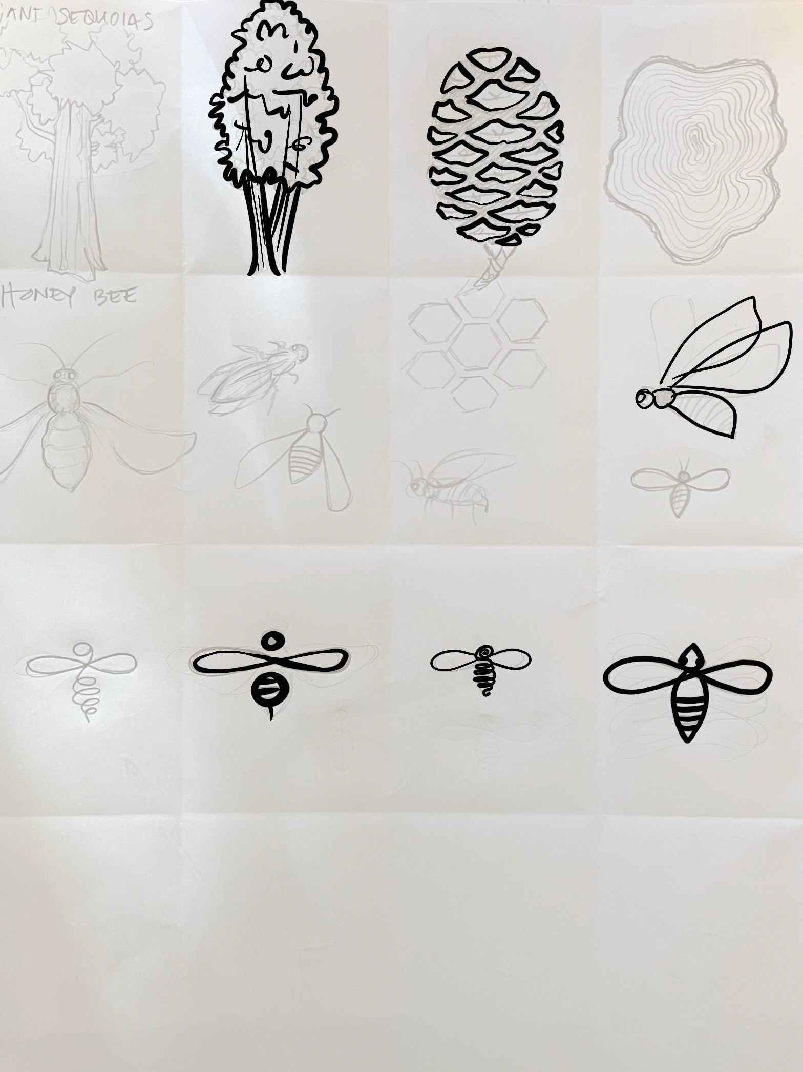
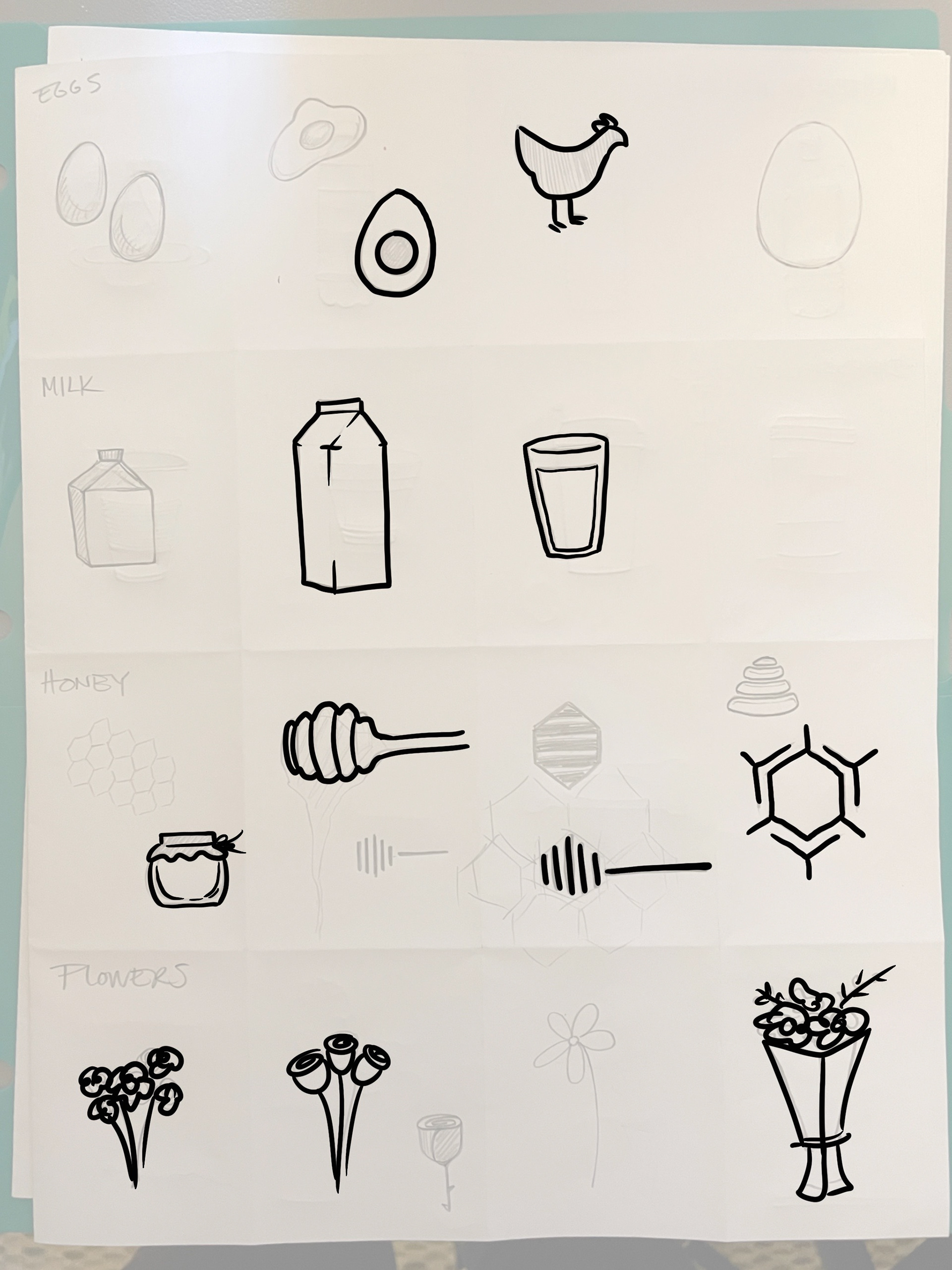
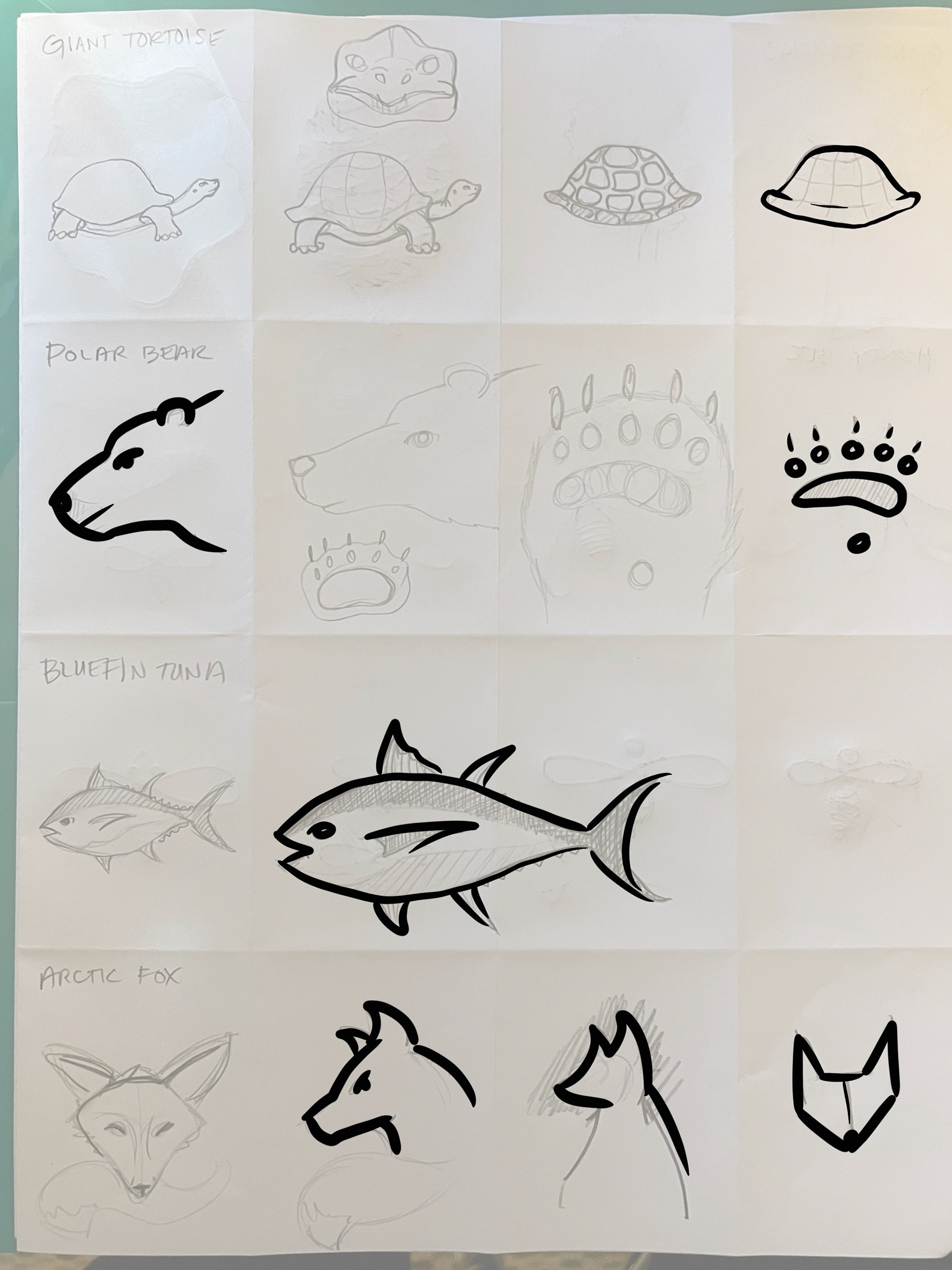
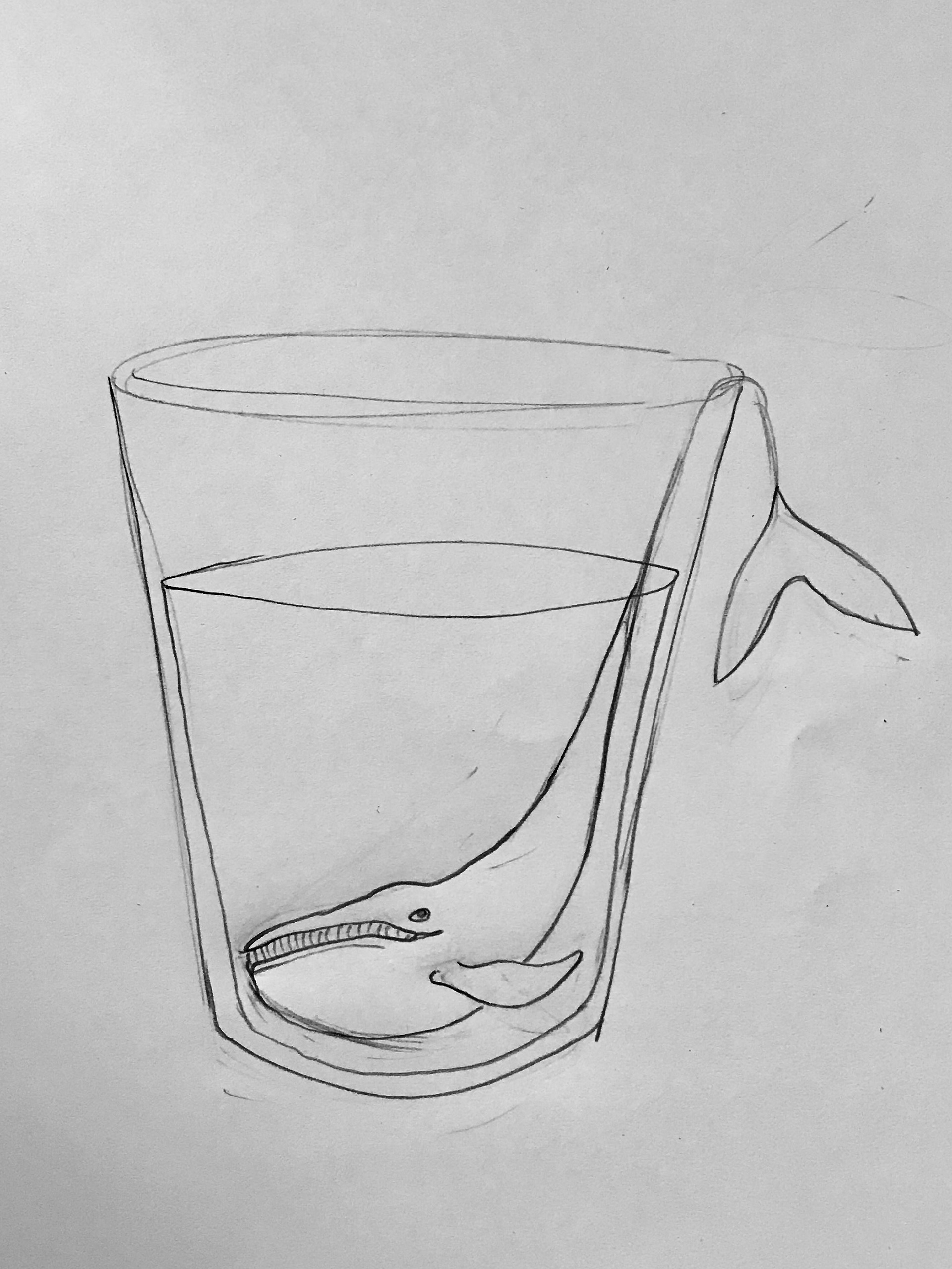
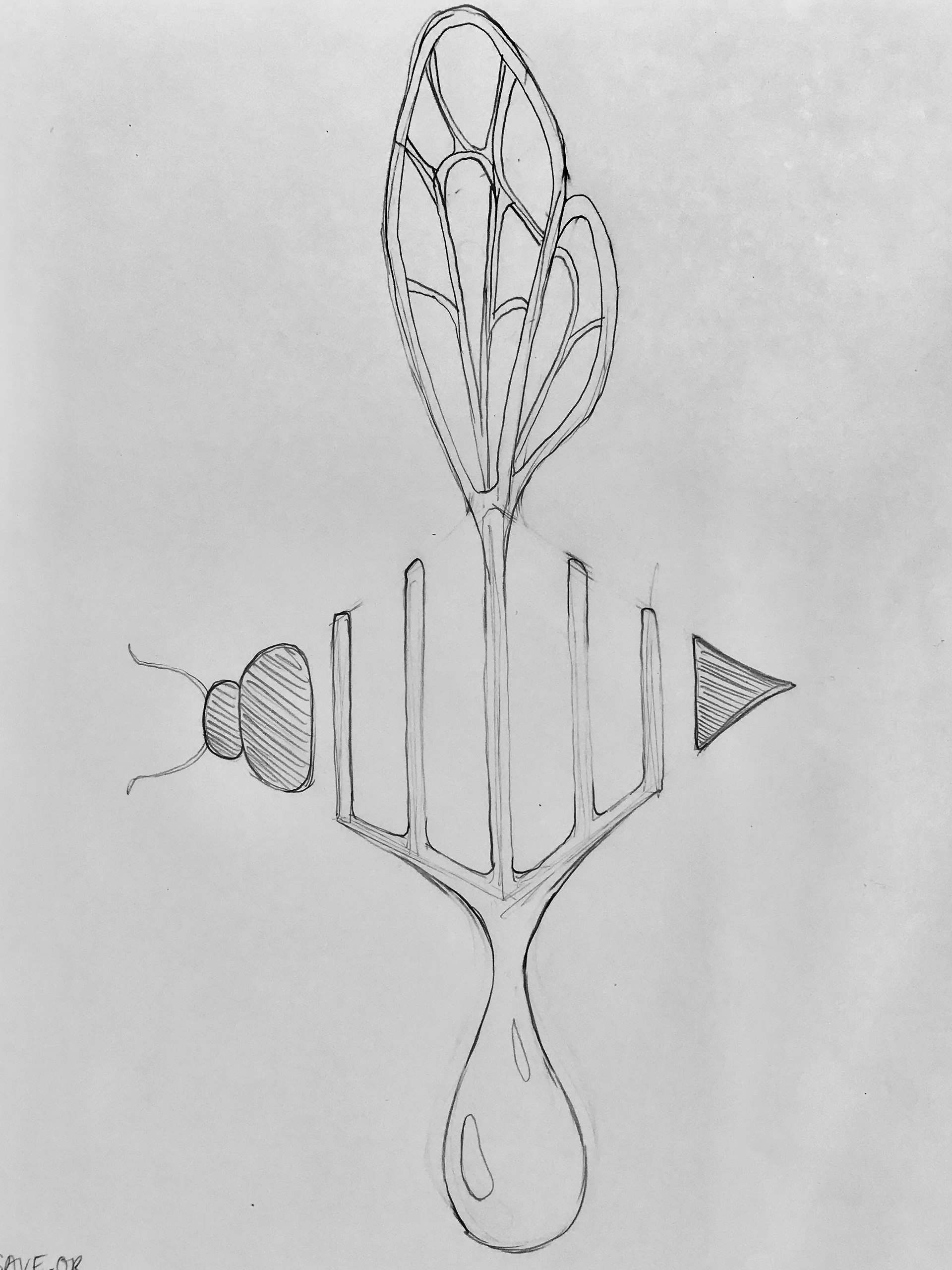
To get started, I compiled a list of animals and products to explore. I made sketches and simplified my drawings to bold lines and shapes. I selected the sketches with the greatest potential to connect. Then I started brainstorming how to put them together visually. I began sketching in Procreate which allowed for quick iteration and color exploration.
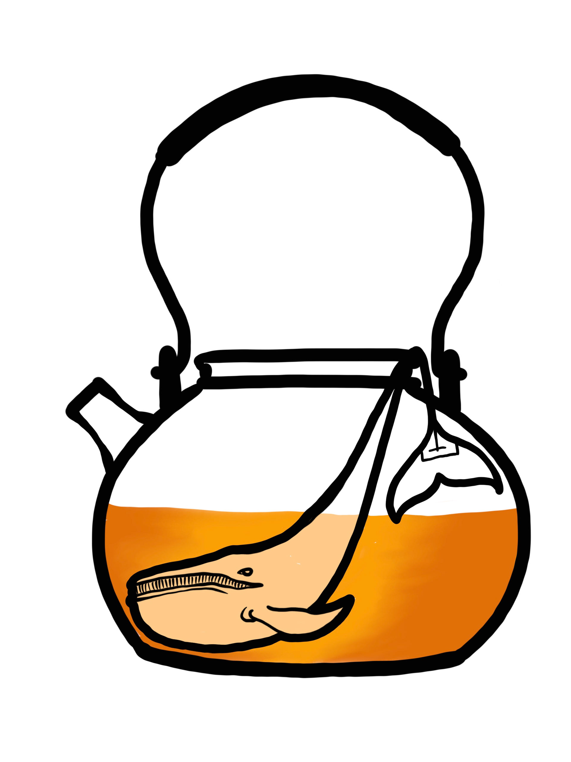
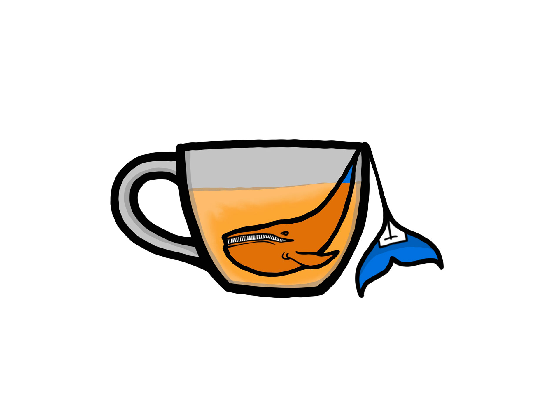
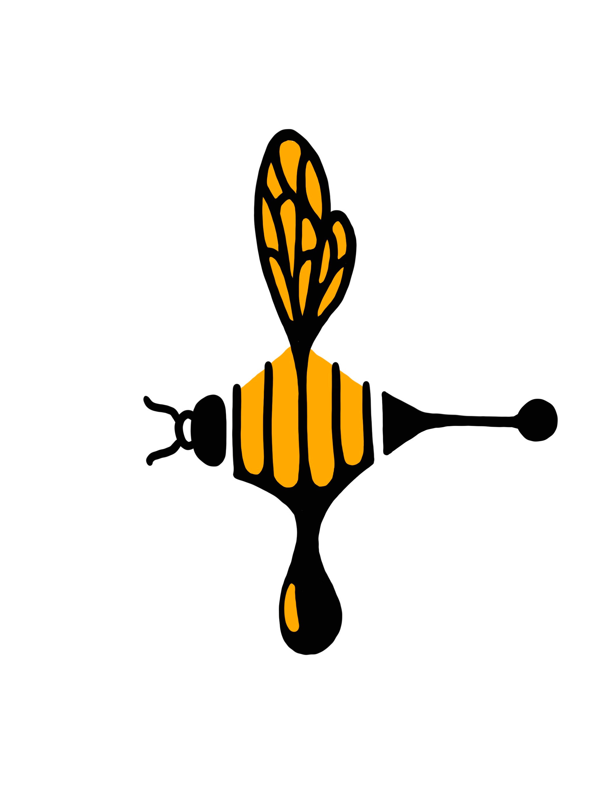
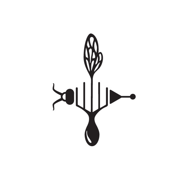
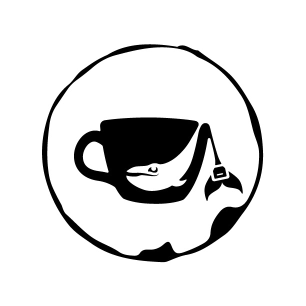
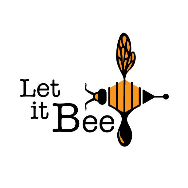
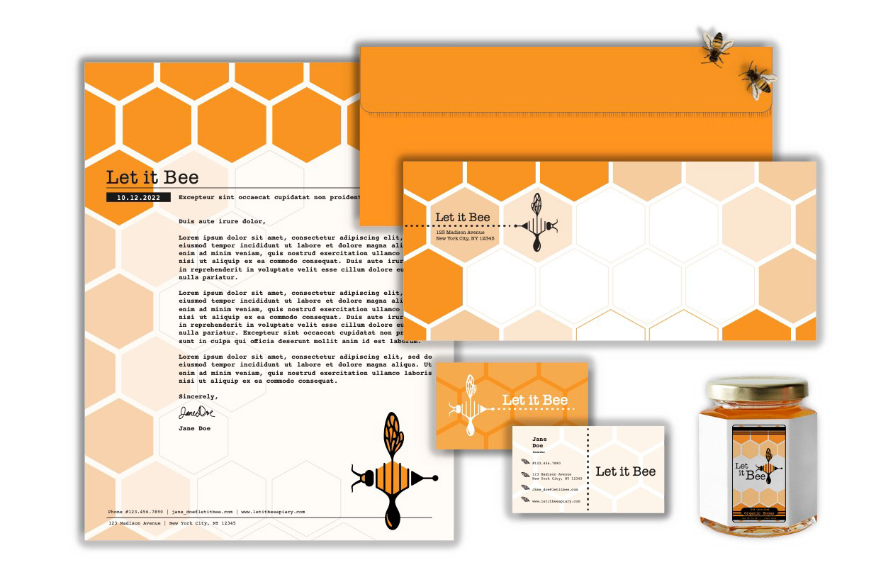
I chose to develop a tea company that raises money to save blue whales and a honey company that supports efforts to increase honey bee populations.
Challenges:
The greatest challenge of this project was in the early planning stages. With a relatively open-ended brief, it was difficult to decide which direction to go. Making lots of sketches of different ideas helped me to sort out what resonated with me for this project. I started to notice visual elements that could meld from one sketch to another. Once I started seeing these connections, I was quickly able to develop my ideas.
Another challenge was simplifying the images enough to work as logos, especially in the context where the logo would need to be scaled to a small size. I noticed how important it would be to keep my lines bold and avoid small details. I explored ways to use negative space to create shapes from my line drawings. I made sure to consider that my logo would need to work as a black and white image as well as color.
Success:
Throughout the process of defining the visual elements, I incorporated a brand name and typography to complement the visual identity. When it came time to work on the details of my logos, I found ways to adjust my images to match the character of the typography, and vice versa.
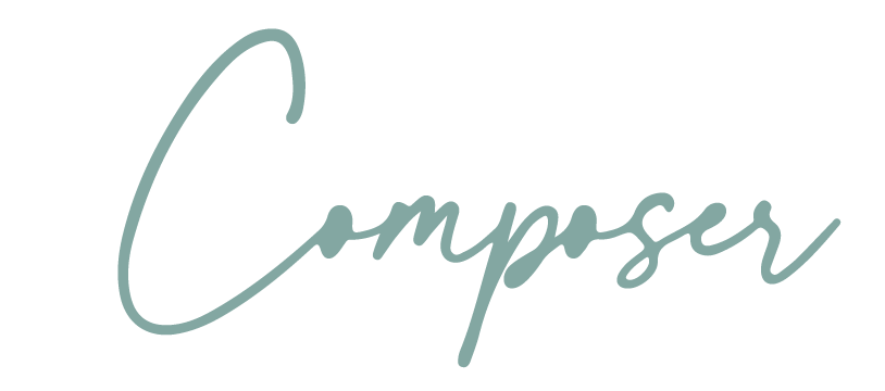
In the end, I create visually striking brand identities for True Blue Brew, a tea company, and a honey producing apiary called Let it Bee. The logos can be printed in color or black and white without losing brand information. The final logos inspired additional branded items (stationery set) demonstrating a flexible visual identity system.
Reflection:
Looking back on this project, I noticed some things about my process that I will change in the future.
With Let it Bee, the vibe felt intuitive to me. The product spoke to me as artistic or whimsical and retro. The color was inspired by the honey bee, and I was able to adapt my logo's line quality to that of the old fashioned typewriter typography I selected. However, there was a period of time after the initial logo development that I changed the name of the business so the typography would better fit around my logo. This is not likely something I would be able to do had I been working with an established business.
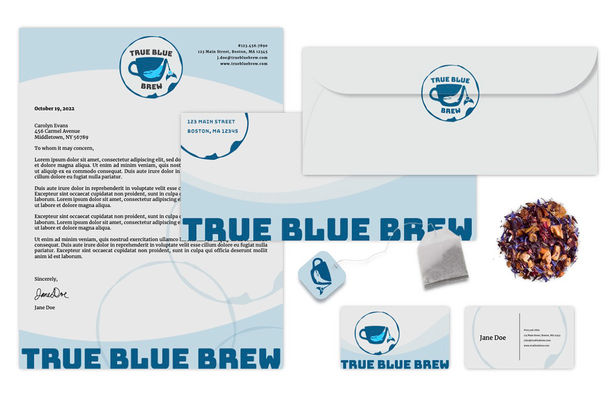
With True Blue Brew, I noticed that the visual brand language developed more slowly over the course of the project. I likely could have been more purposeful or efficient had I determined a mood/style and primary user demographic at the beginning and designed around that. I defined the logo without defining the brand identity. It wasn't until I began branching out and creating the stationery items that the brand identity took shape.
I recognize that this order of operations may not closely mimic a real-world application. A design brief will generally include some guidelines about what a client is looking for, the brand's target audience and the style of visual brand identity they are going for.
Starting with more constraints can sometimes, paradoxically, fuel creativity. It makes the problem more concrete, and it allows designers to run their ideas through a litmus test to help determine whether their solutions meet the needs of their clients.
I look forward to working on more projects like this. Using what I have learned, I know I will work more purposefully and effectively in the future.