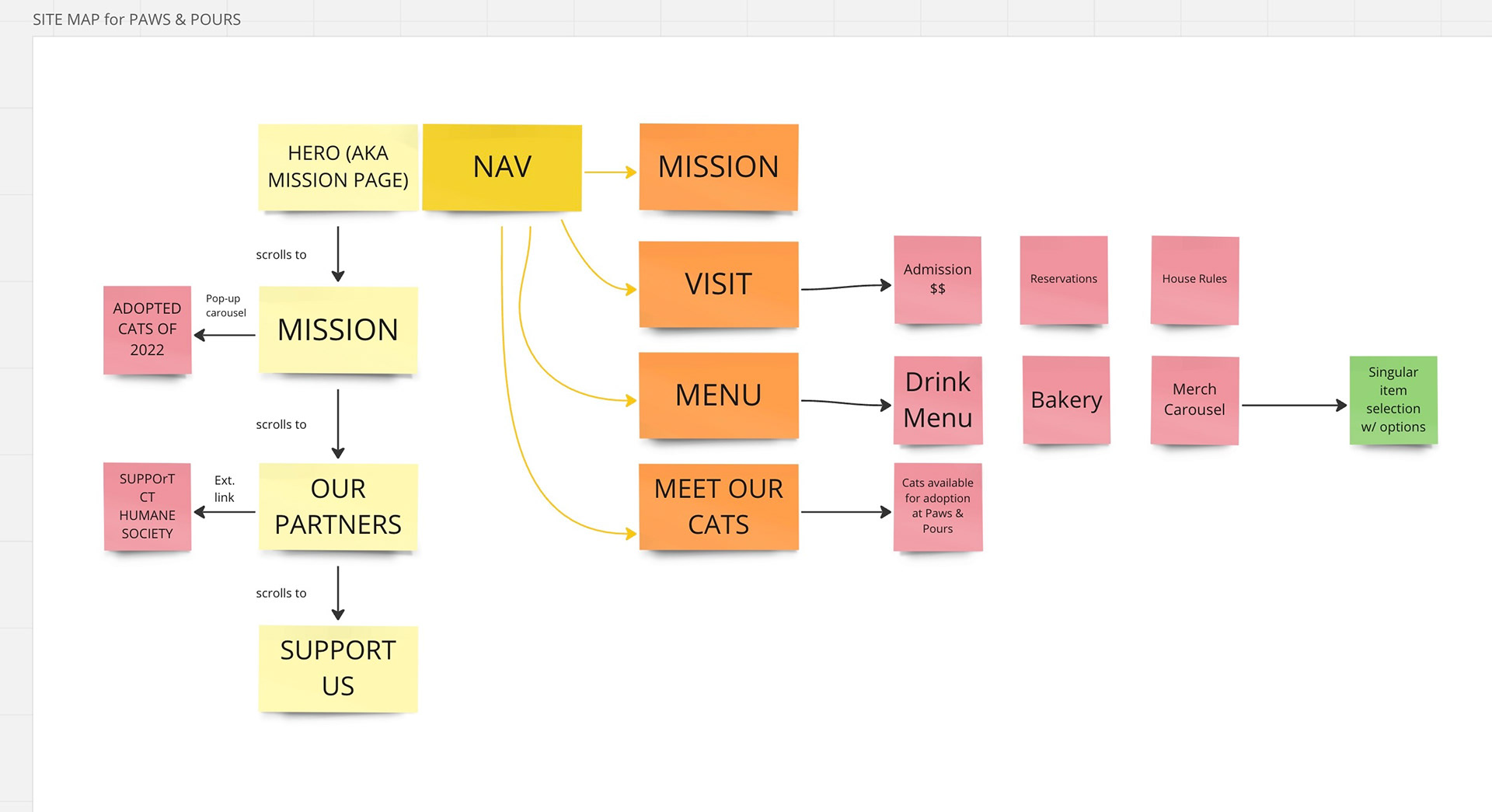
Site Map
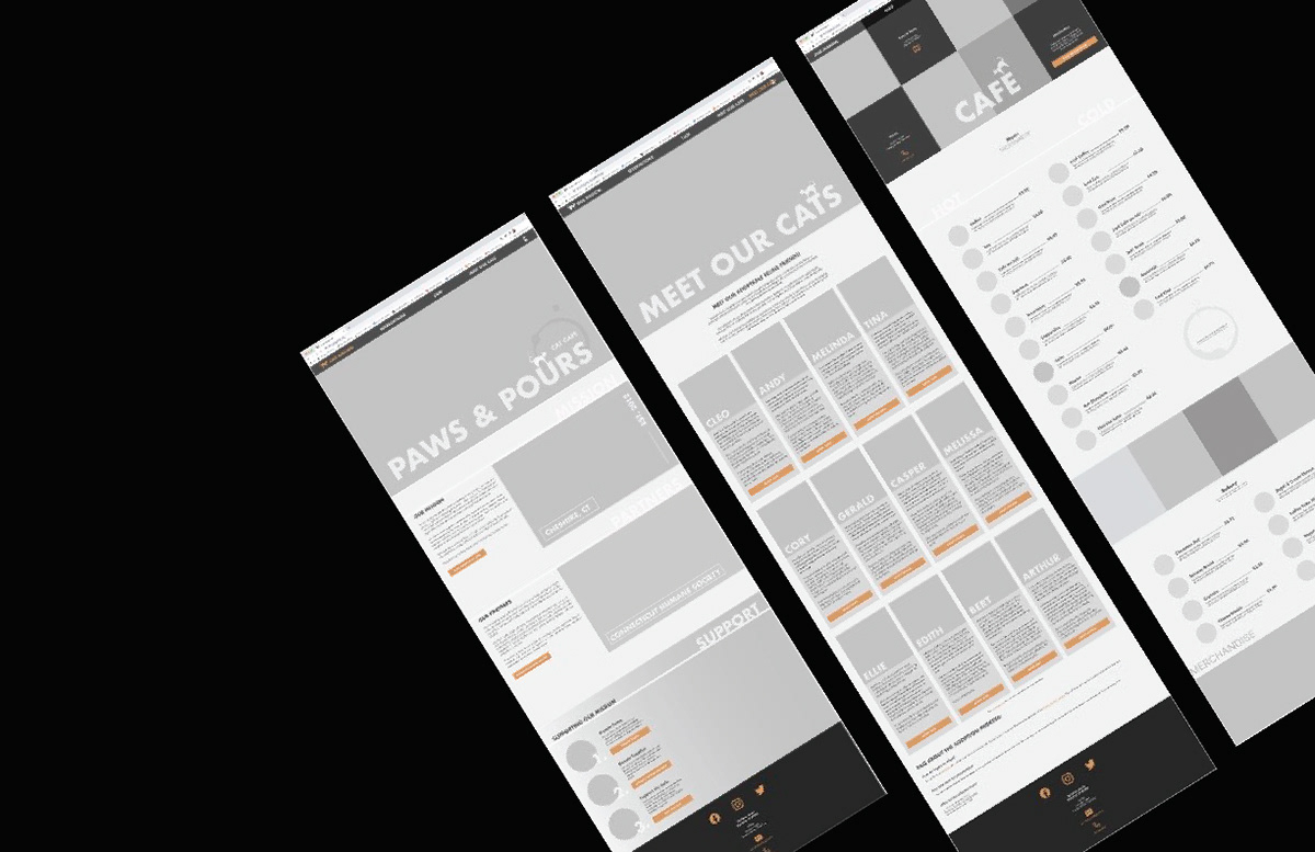
Lo-Fidelity Prototypes
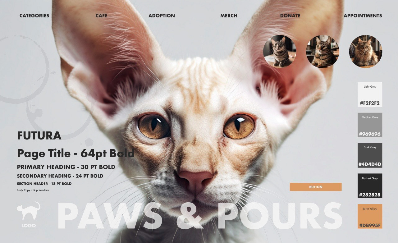
Style Guide | Brand Identity
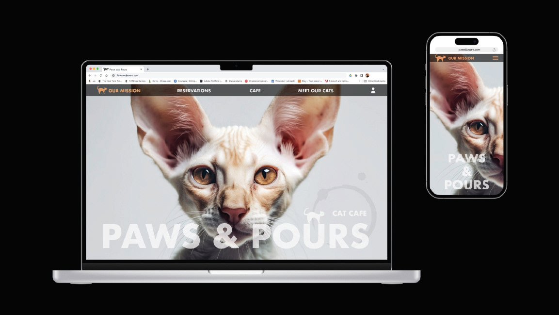
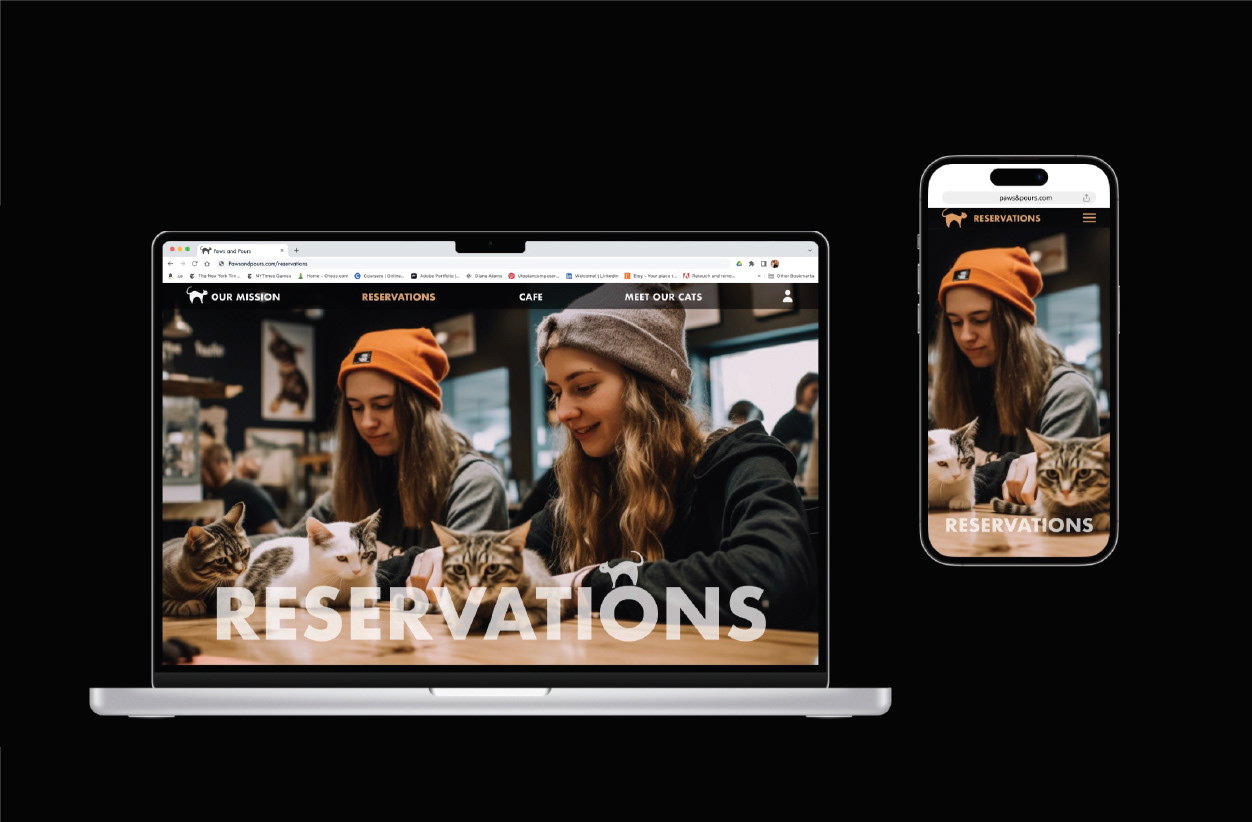
See Paws & Pours firsthand in the video walkthrough above.
See the mobile version of Paws & Pours in the video walkthrough above.
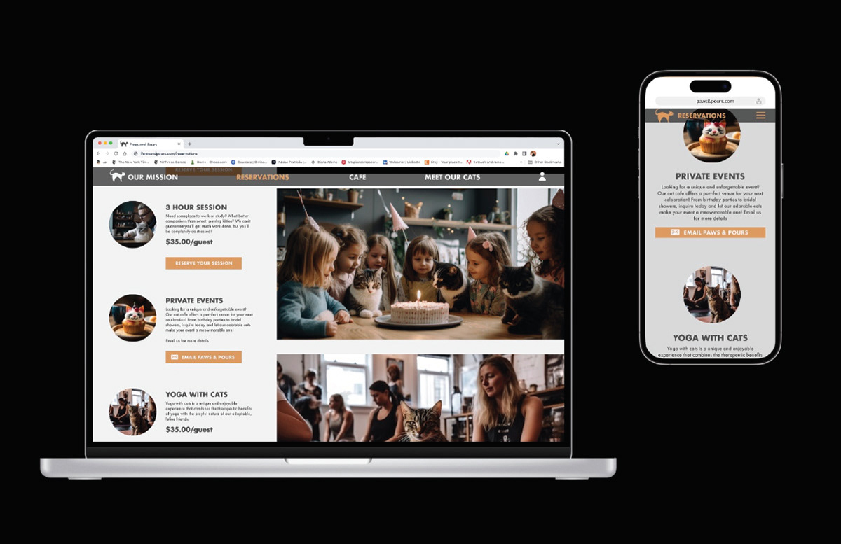
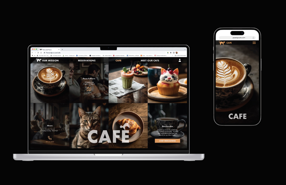
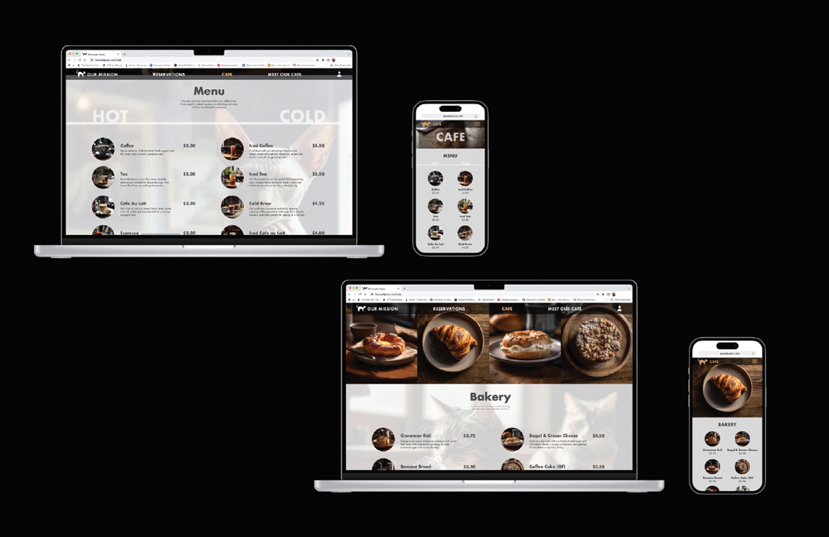
In order to make better use of the limited screen space on mobile devices, I made the decision to remove some of the larger images when designing the mobile version. This helped to improve the website flow and allowed for a more streamlined and efficient user experience.
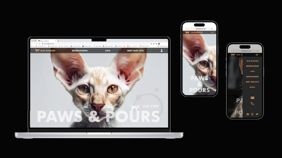
Additionally, I made adjustments to the menu and navigation on the mobile version to ensure ease of use for visitors using smaller screens.
I removed some of the less critical information when designing the mobile version. This allows visitors to quickly and easily find the most important information without overwhelming users.
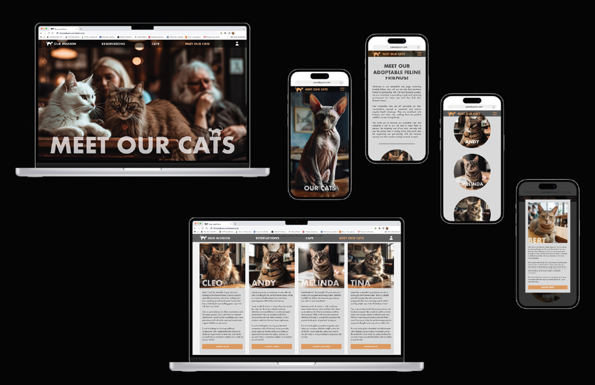
I made changes to the adoption profiles on the mobile version of the website. Instead of including detailed information about each cat on the main page, I created pop-ups that visitors could access to learn more about each cat. This not only made the mobile version more interactive, but also saved valuable screen space, allowing visitors to view the website's content without having to scroll endlessly.
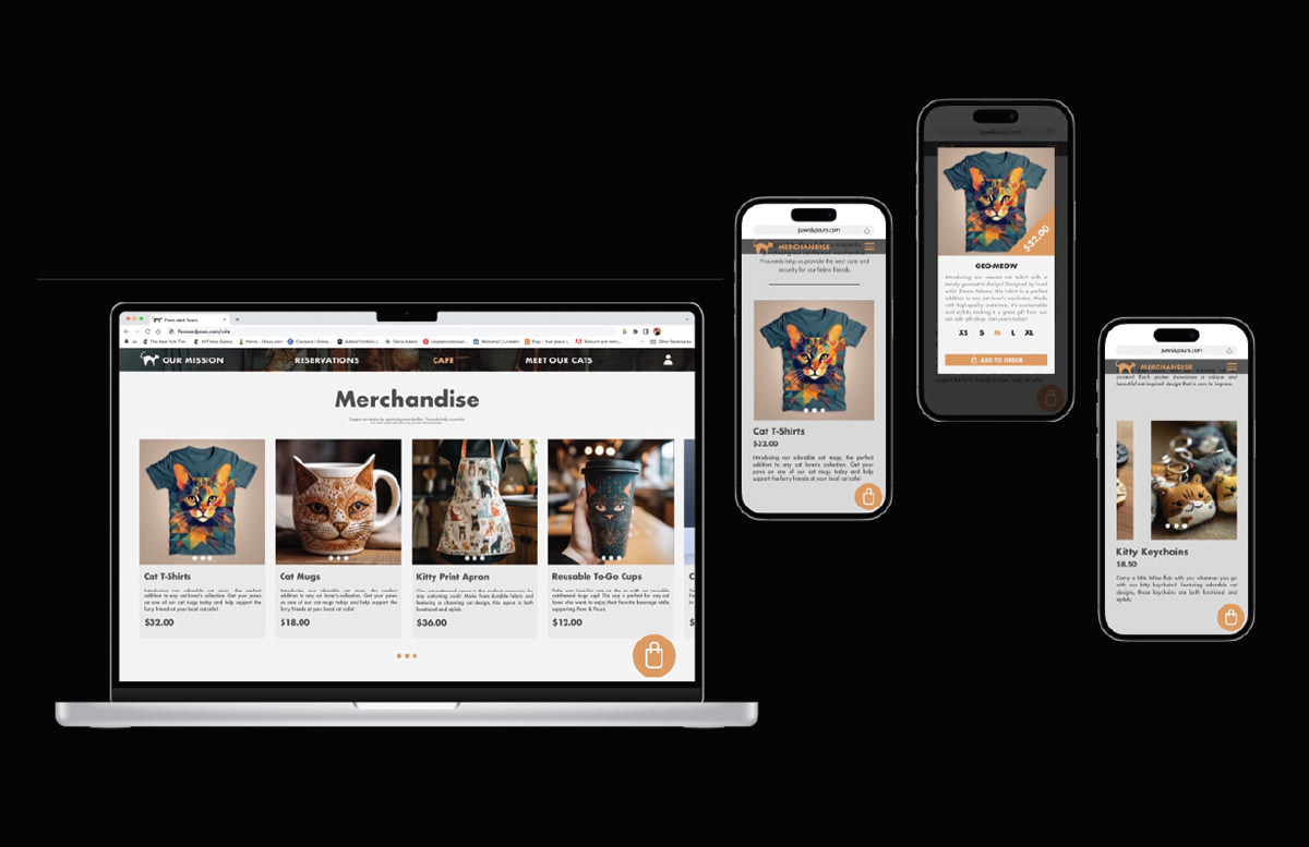
I created a separate merchandise page for the mobile version of the website to improve user experience and make it easier for visitors to access and purchase the cat cafe's merchandise.

